

A SaaS website has two jobs. It has to show a buyer landing on the homepage who the product is for and how to start. It also has to be clear enough that AI assistants like ChatGPT describe the product correctly when someone asks them for software like it.
We've built more than 30 websites in the last six years. Each one now starts with research into who the buyer is and the words they search with, and the design follows from that. This guide walks through that process on TeamUpp, the competition software we built and launched on 18 November 2026. Along the way we share the prompts we used and what a site like TeamUpp costs in Australia.
What a SaaS website has to do
On a first visit, a software website has one job: the right buyer recognises their own problem and sees an easy way to start. Nielsen Norman Group found that people decide within about ten seconds whether a page is worth their time, and pages that make their value clear in that window keep visitors for minutes (NN/g). We judge every homepage decision against that window.
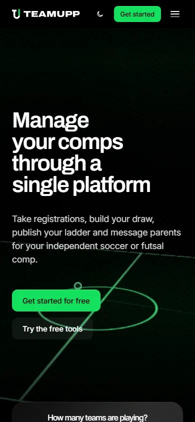
TeamUpp sells to people who run their own soccer and futsal competitions. The headline says what the product does for them, the line beside it lists the weekly jobs it takes over, and both buttons start something free, so an organiser can try it before their coffee goes cold.
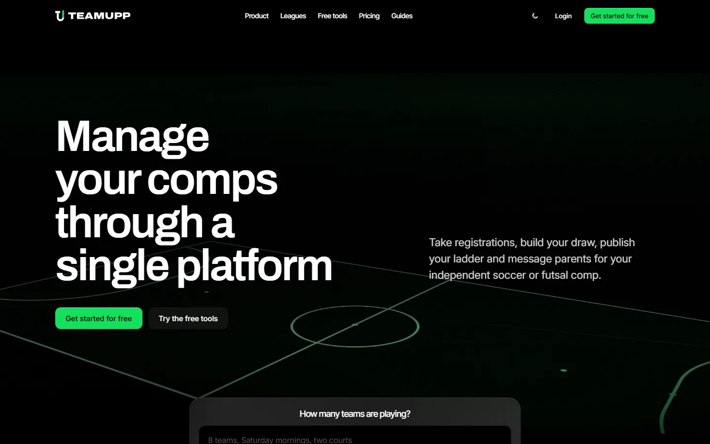
- Free start, always in view
- What it does, plainly
- The weekly jobs it replaces
- Two ways to start free
- Setup starts on the homepage
The second reader is a machine. Google, Bing and assistants such as ChatGPT now answer a lot of software questions directly, and they quote the sites they can read with confidence. Setting this up at launch costs a few hours, and retrofitting it later is the rebuild we see founders pay for most often.
Should you build on Wix, Webflow, Lovable or Next.js?
For a SaaS website, we recommend Next.js hosted on Vercel, because it gives you full control of the code, the search setup and the connection into your product. We've built more than 30 websites in the last six years. Some early ones went on Wix or Webflow, and today every site we build is Next.js on Vercel.
Wix is easy to pick up and flexible to design in, and it got clunky once a site grew past a handful of pages, with hard limits on the automations we could connect. Webflow has a strong CMS and a good template ecosystem, though it takes real time to learn and it pushes back on ambitious layouts. Next.js gives the client the whole site as code they own, so a CRM integration or a pricing calculator becomes an engineering decision instead of a platform limit, and a marketing site on Vercel costs very little to host.
As part of our own market research we've tested AI builders such as Lovable and Bolt, and they're best used for prototyping. They're good at putting an idea in front of a few customers within a day. A good share of our clients come to us after taking a software or website prototype as far as those tools would go, usually at the point where they need proper search setup, a connection into their product and code their own team can maintain.
| Platform | Where it works well | Where it slows you down |
|---|---|---|
| Wix | Easy to learn, flexible visual design, fine for a simple brochure site | Harder to manage as pages grow, limited automations and integrations |
| Webflow | Strong CMS, scales to large content sites, big template ecosystem | Steep learning curve, some layouts and interactions are restrictive |
| Framer | Fast visual design for a polished launch page | Content and integrations stay inside Framer's own system |
| AI builders (Lovable, Bolt, v0) | Vibe coding a clickable prototype from a prompt | Best kept to prototypes, because production sites need control of the code, the search setup and product integrations |
| Next.js, hosted on Vercel | Full control of design and code, quick to change, low hosting cost, strong technical SEO | Needs an experienced engineer to build and maintain |
Write an ideal customer profile before the homepage
An ideal customer profile (ICP) describes the business most likely to buy your product, get value from it quickly and stay. We write one before anything else on every website and software build, because every headline, feature and price on the site gets checked against it.
TeamUpp's ICP is the person running an independent competition, such as an indoor centre, a weeknight social league, a tournament organiser or a private academy. Before TeamUpp they took registrations through forms, built the draw in a spreadsheet, chased payments by bank transfer and answered parents in group chats. We left state associations out on purpose, because they buy through committees and tenders, and a site written for them would sound wrong to an operator who makes the call alone on a Tuesday night.
The most useful part of an ICP for website work is the buyer's own vocabulary. TeamUpp's buyers say "comp", "draw" and "ladder", so the site does too. The search research went through the same filter: early keyword lists were full of fans looking up professional fixtures, which looked like traffic and would have brought the wrong visitors, so we cut every search a player or fan would make and kept the ones an organiser would make.
Run a competitor website analysis
A competitor website analysis shows you which positions are taken and which one is open. We pick a handful of sites in and around the category, including the products the buyer already knows and a few strong software sites from other categories, and we go through each one section by section.
| What we record | What it tells you |
|---|---|
| The hero headline and the buyer it names | Which promise is crowded and which buyer nobody speaks to |
| Where real product screenshots first appear | How much proof buyers in this category expect before they scroll |
| Whether pricing is public | Whether the category sells self-serve or through a sales call |
| The main call to action | What the buyer is used to doing first |
| The searches each site ranks for | Which keywords a new domain can realistically win |
| The section order on the homepage | The patterns buyers have learned to scan |
For TeamUpp, the established platforms mostly spoke to associations and clubs with committees. The open position was the operator who wants to start free and only pay when their players pay, and the whole site was written to own it.
Build a small design system first
A design system is the short list of decisions every page inherits: colours, the type scale, spacing, corner radius, motion timing and a handful of components such as buttons, cards and form fields. We set it up before the first page because it's what makes page twenty look like page one, and it lets a new page go from brief to live in an hour.
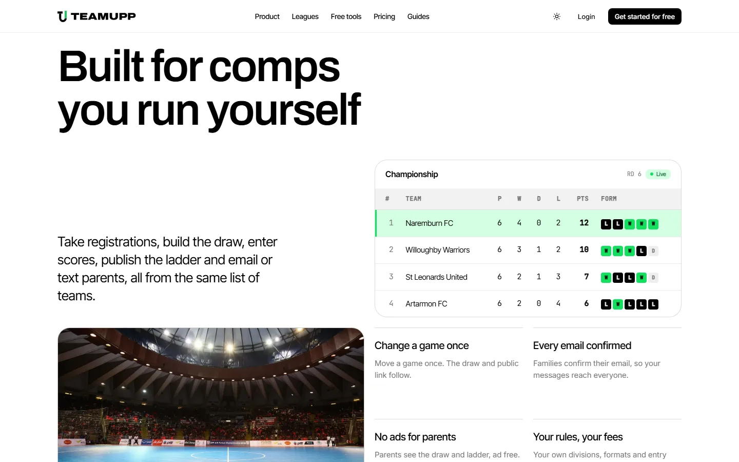
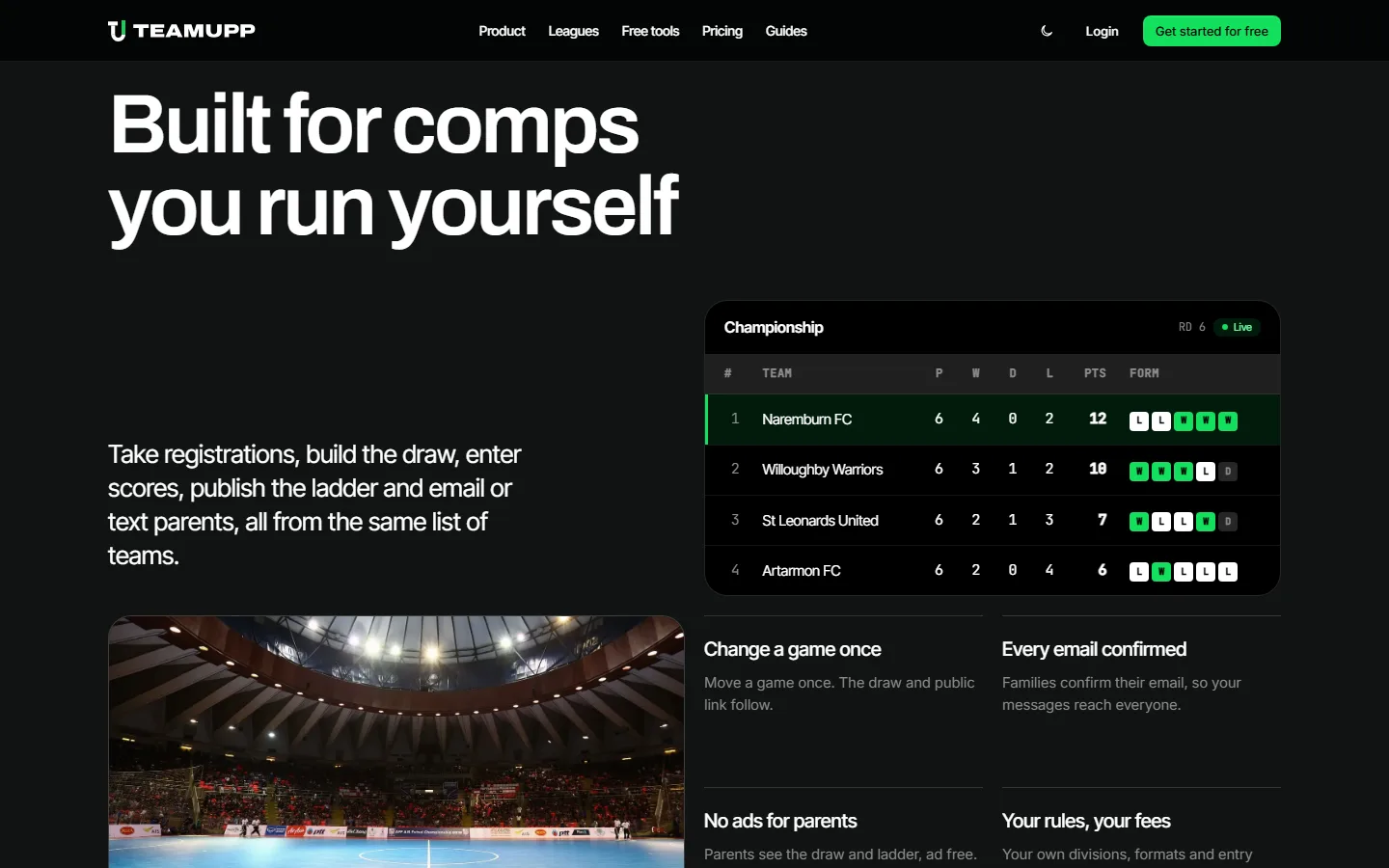
TeamUpp's system keeps black and white for almost everything and saves the brand green for actions and live states, so the eye always lands on the next thing to click. Headings use Inter Tight, body text uses Inter and data labels use JetBrains Mono, which makes the marketing pages and the product screenshots feel like the same product. Every colour is a token with a light and a dark value, so the theme switch in the header changes the whole site at once.
What sections does a SaaS landing page need?
A SaaS landing page needs a hero, one scroll story at most, feature cards, proof, answers to common questions and a closing call to action, in roughly that order. Buyers have learned to scan software sites this way, and it's the homepage structure we start from on every build. The examples below come from the live TeamUpp site.
- Hero: the outcome in under ten words, the buyer named in one sentence and a free way to start.
- Story: a short scrolling sequence about the change in the buyer's week.
- Features: each card names a job the product does and the result the buyer sees.
- Proof: logos, numbers or a quote from a real customer.
- Questions: the objections a buyer raises before signing up, answered plainly.
- Closing call to action: the same free start as the hero.
The hero
The hero answers what the product is, who it's for and what to do next. Behind TeamUpp's headline, a slowly orbiting futsal court tells a visitor which sport the product serves before they've read a word. We slowed and dimmed it several times until it sat behind the headline instead of competing with it. The theme switch is in the header if you want to try it.
The scroll story
A scroll story gives one idea a full screen while the visitor scrolls. TeamUpp uses it once: futsal court markings draw themselves in, the court floods green, and the line "One system to manage everything" rises into the centre circle. That's the idea we want an organiser to remember after they close the tab, and the court tells them it was built for their sport. We keep motion like this to one or two moments per page, since every extra animation delays the buyer reaching the button.
Feature cards
Feature cards work when each one names a job the buyer recognises and what changes once the product does it. TeamUpp's "Change a game once" card says the draw and the public link update together, which is the moment an organiser stops fielding calls about the wrong kick-off time. Above the cards sits a live ladder built from the same components as the product, so the first thing a buyer sees in the section is the result their parents will check every Saturday.
Proof, questions and the closing call to action
Proof comes after the features, because that's when a buyer starts wondering whether it works for people like them. The questions section then handles what stops a sign-up, such as cost, setup time and moving existing data across. The page closes on the same free start as the hero, so a buyer who reads to the bottom can act without scrolling back up.
Wireframe the website with real copy
We wireframe in the browser with real headlines and real buttons, because grey boxes hide the hardest decisions. Words on the page show straight away whether the structure makes sense to a buyer, and the founder has something concrete to push back on.
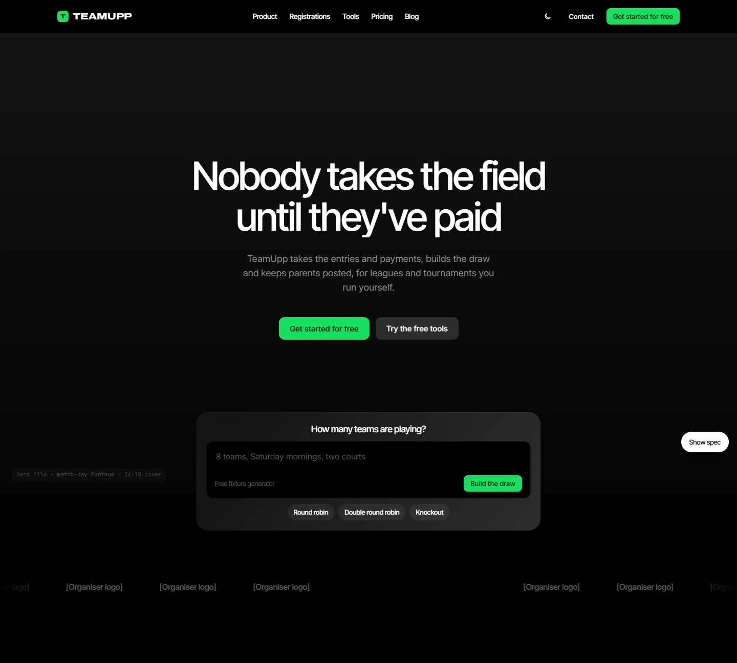
TeamUpp's first headline was "Nobody takes the field until they've paid". It was memorable, and it made the product sound like a debt collector when it actually runs the whole competition. The second attempt, "Change it once and the whole league knows", asked a busy organiser to decode it. The final headline, "Manage your comps through a single platform", says plainly what they get.
The wireframe also caught a call-to-action mistake. TeamUpp is self-serve, so every "Book a demo" button became "Get started for free". That took ten minutes in a wireframe, and after launch it would have meant touching every page.
Write website copy a busy buyer understands
Good software copy reads like someone explaining the product across a desk. We use the buyer's own words, keep headlines short and swap every abstract claim for the specific job the product does. On TeamUpp that meant "build the draw" and "publish the ladder", which are the exact phrases an Australian organiser uses.
Every client site also gets a written copy standard, and every page is checked against it automatically before it ships. It sets the tone, bans the phrases that sound like generic marketing and caps the length of each type of text. The automated check earns its keep once a site has dozens of pages, because one tired phrase repeated across a template is easy to miss by eye.
Self-serve or sales-led: what changes on a B2B SaaS website
The biggest structural decision on a B2B SaaS website is how a buyer starts. A self-serve product lets them sign up and get value alone, so the site's job is to get them into the product. A sales-led product needs a conversation before anyone pays, so the site's job is to earn that conversation with the right buyer.
| Part of the site | Self-serve SaaS | Sales-led B2B SaaS |
|---|---|---|
| Main call to action | Get started for free | Book a demo or talk to sales |
| Pricing page | Public prices and plans | A starting price or the factors that set the price |
| Proof | Screenshots and short quotes from similar users | Case studies with business outcomes and named customers |
| Content | Guides and free tools that bring users in | Comparison pages and guides for each buying role |
| What the site measures | Sign-ups and activated accounts | Qualified demo requests |
TeamUpp is self-serve, so every page ends in a free start and pricing is public. Some businesses sit elsewhere, such as a service business running on its own custom software. Adapt Health is one of ours: its website books new members straight into the same app their coaches program each week, so the brand feels continuous from the first click to the first session.
What should a SaaS pricing page include?
A SaaS pricing page converts when the buyer can see what they'll pay and how to start without doing maths. For early-stage products we keep it to two or three plans, put the free option first and repeat the call to action used everywhere else on the site.
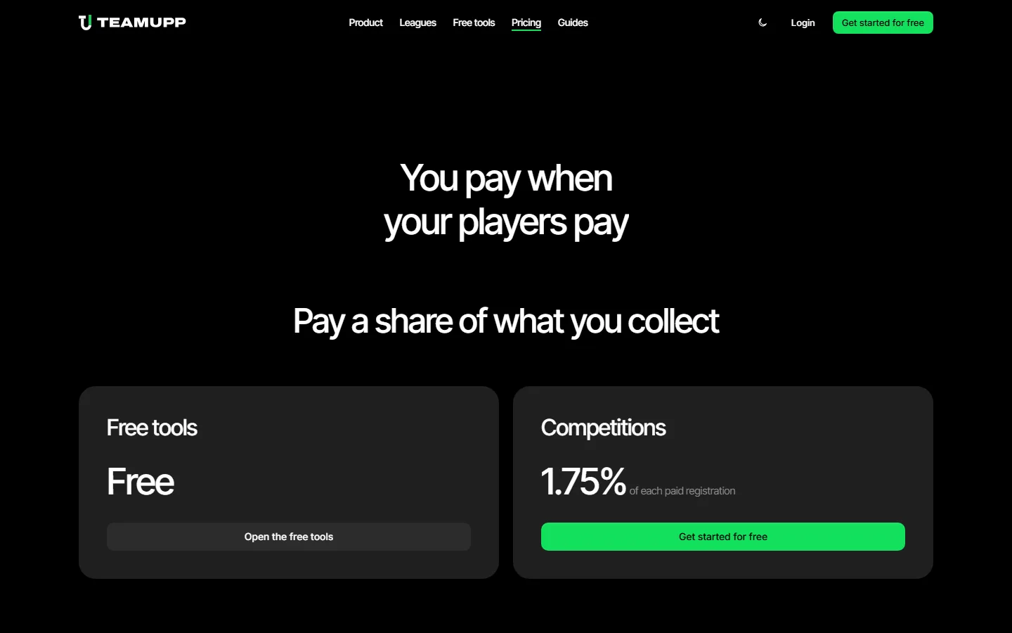
TeamUpp's pricing leads with "You pay when your players pay". The free tools cost nothing, and the competitions plan takes 1.75% of each paid registration. That model answers the biggest worry an independent operator has, which is paying a monthly fee before the season fills, so the number reads as fair before anyone compares it to a competitor.
- Match the price to how the buyer earns. Per registration, per seat and per location each suit a different buyer, so pick the one that grows with their business.
- Answer the pricing questions on the page. Fees, contracts, cancellation and data export are what stop a sign-up, so answer them under the plans.
- Give each plan one call to action. The free plan starts the product, and a sales-led plan books a call.
- Publish the price if the product is self-serve. A hidden price adds a step the buyer has no reason to take.
How we build the site
By the time we start building, the buyer, the wireframes, the copy and the design system are signed off, so the build is about turning settled decisions into fast, clean pages. Every page goes through code review and automated checks for speed, accessibility and search before it ships.
- A written brief for every page, so the build starts from decisions the founder has already approved.
- The design system as the only source of styles, so a new page can't drift from the brand.
- Automated checks on every change, covering types, broken links and the copy standard.
- A review at desktop and phone widths before anything merges.
- Content kept separate from layout, so a copy change can never break a page.
Pages render as static HTML on Vercel, so they load fast and every word is readable by search engines and AI crawlers without running any JavaScript. Approved changes are live within minutes of merging.
Show the real product with a demo account
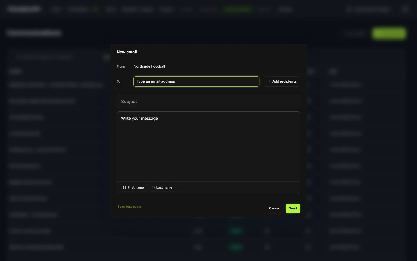
Screenshots of the real product are the strongest proof a SaaS website has, and an empty account makes a poor screenshot. Before capturing anything for TeamUpp, we set up a demo organisation in the live product and filled it with a busy season's worth of data, from competitions and fixtures through to messages and payment history. Every product image on the site comes from that one account.
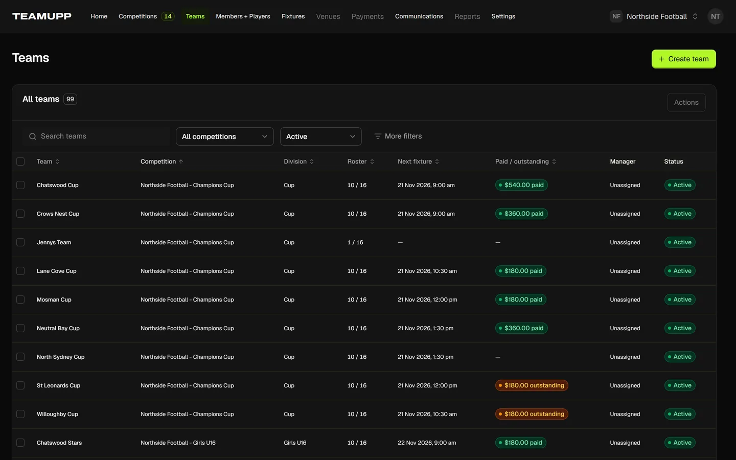
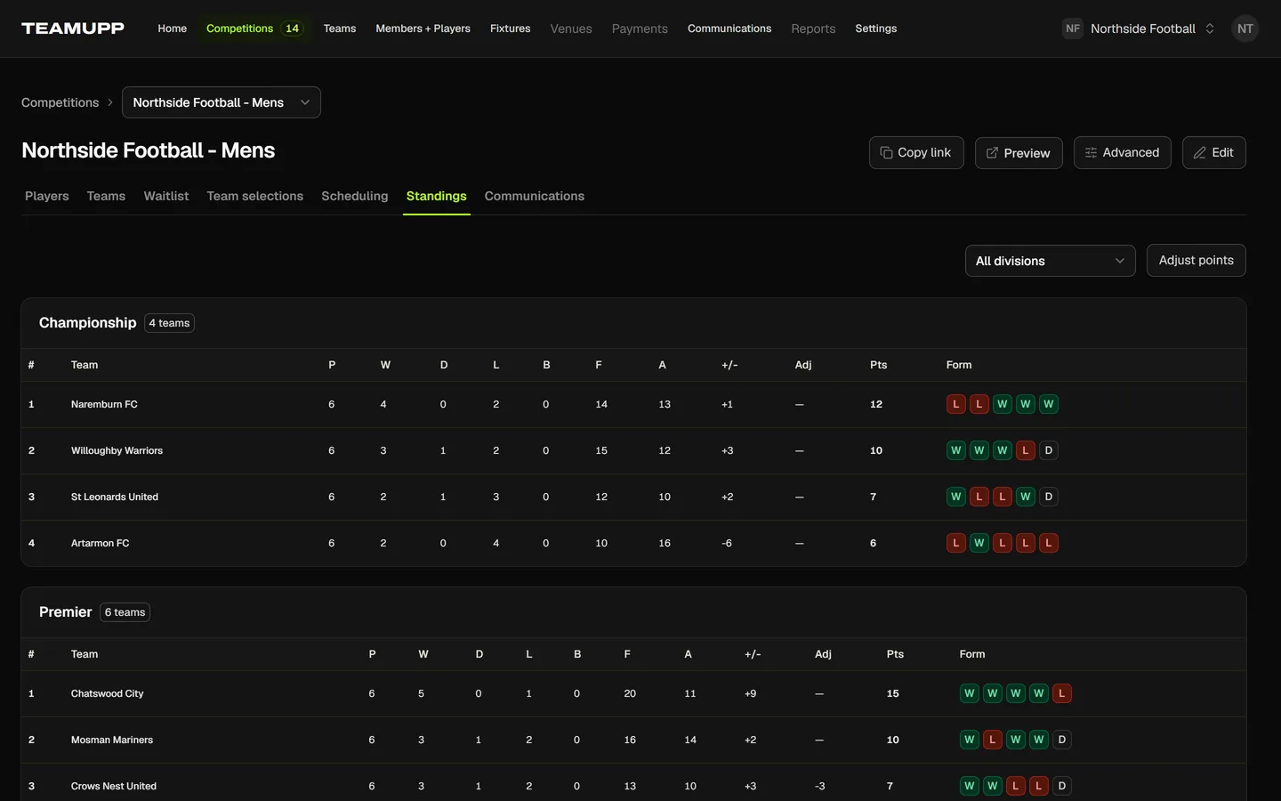
The demo account also gives us control over what each screenshot says. We skipped screens with red warnings, empty lists or anyone's real details, and we connected test payments so setup banners never appear. When the product changes, we recapture from the same account and every image on the site updates together.
Give buyers a reason to find you
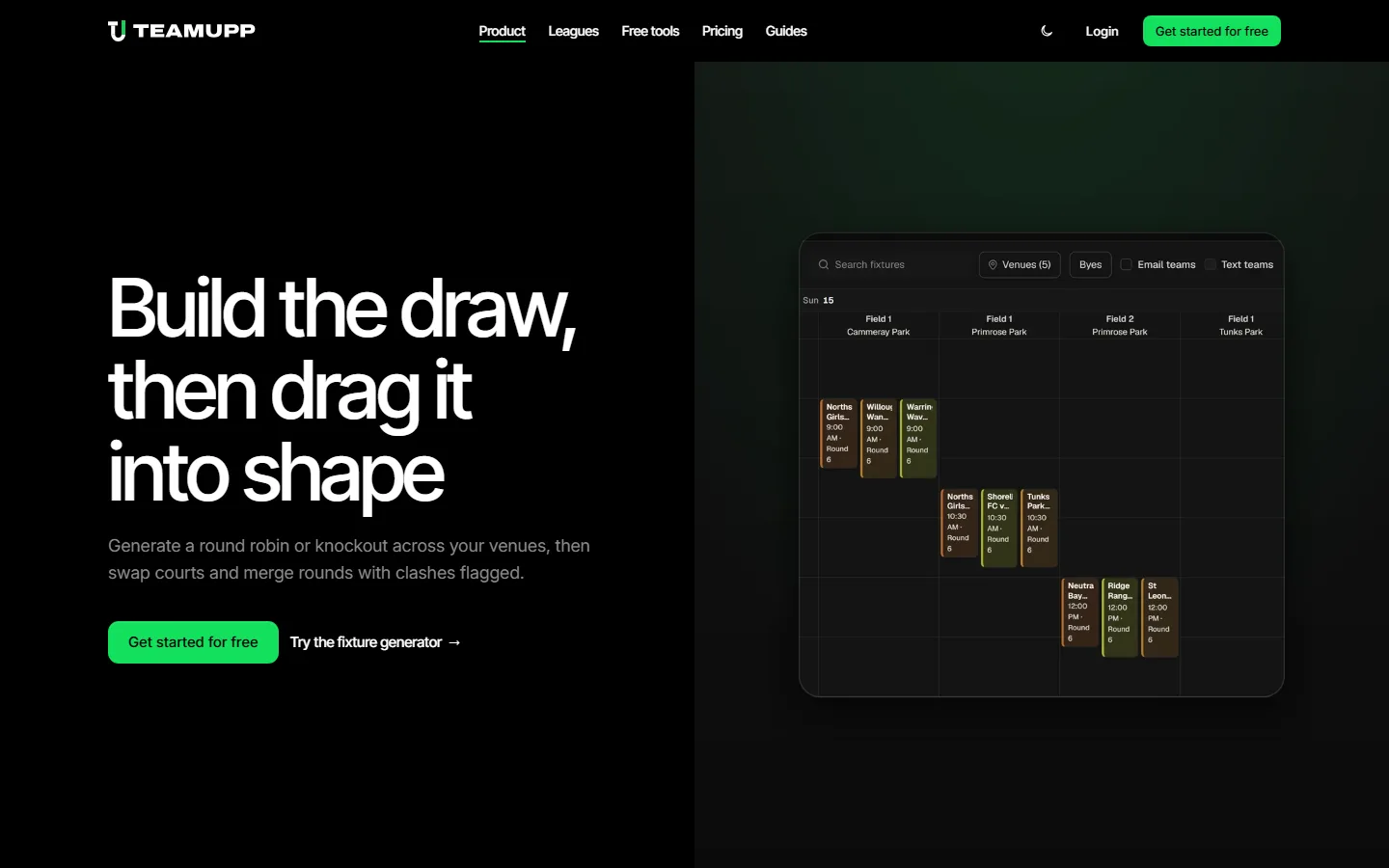
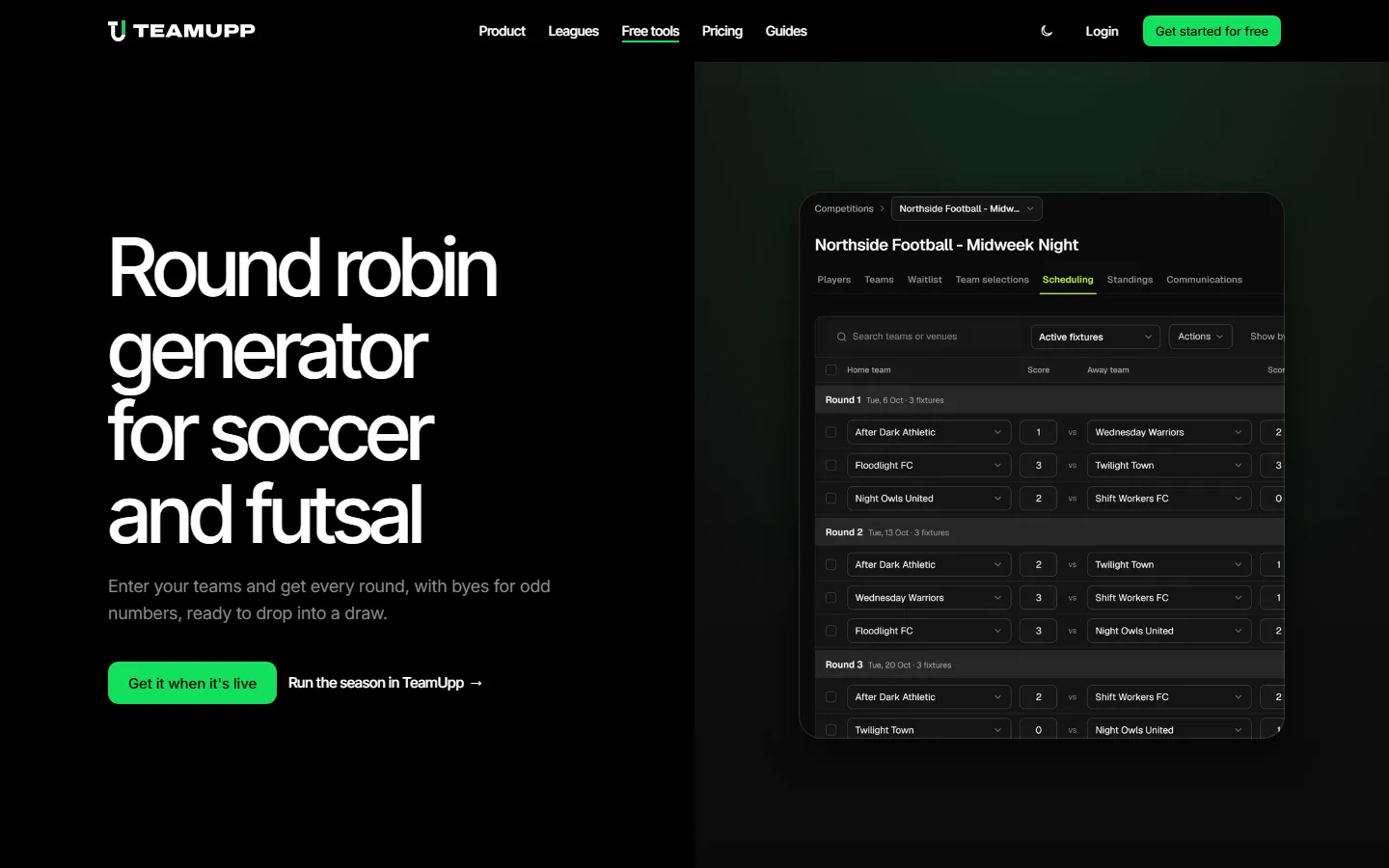
SEO for a SaaS startup works best when the site answers questions the buyer is already asking. For TeamUpp that meant free tools that finish one job on their own, such as a round robin generator and a fixture generator, plus guides on starting and running a league. Every one of them brings in an organiser who's in the middle of the problem TeamUpp solves, and every one links to the product.
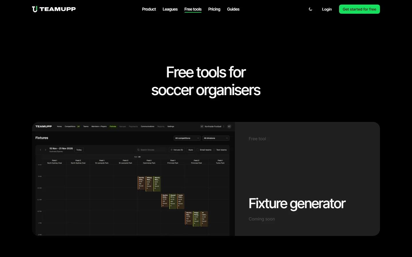
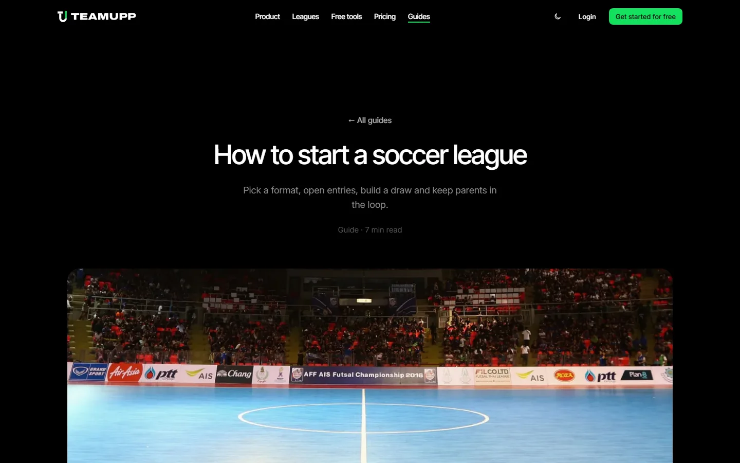
Guides follow the same grouping as the keyword research. We roll related small searches into one thorough guide that can rank for many phrases at once, and each guide links to the feature page that fixes the problem it describes. You're reading one built the same way.
What goes on a website launch checklist for Google and AI search?
A SaaS website is ready to launch once Google and Bing have the domain verified and the sitemap, every page carries structured data and a share image, AI crawlers are allowed in robots.txt and every old URL redirects. We run the same checklist on every site so search engines and AI assistants can find, read and quote it from the first day.
| Check | What we set up | Why it matters |
|---|---|---|
| Google Search Console | Verify the domain, submit the sitemap and watch indexing for the first few weeks | Shows which pages Google has indexed and which searches already bring visitors |
| Bing Webmaster Tools | Verify the site, submit the same sitemap and turn on IndexNow | Bing runs its own index and offers SEO and GEO reports (Bing) |
| Sitemap | A sitemap.xml listing every public page with last-updated dates | Helps a new site with few links get discovered (Google) |
| Structured data | JSON-LD for the organisation, the product, articles, FAQs and breadcrumbs | Gives search engines explicit facts about each page (Google) |
| AI crawler access | robots.txt allows Googlebot, Bingbot, OAI-SearchBot, Claude-SearchBot and PerplexityBot | A site that blocks search crawlers can't be quoted in AI answers |
| Share images | A generated Open Graph image for every page | Links shared in Slack, LinkedIn and messages show a clean preview (Open Graph) |
| Domains and redirects | Marketing site on the main domain, the app on a subdomain, and permanent redirects for every old URL | Existing logins, bookmarks and rankings keep working after the switch |
Schema markup for a SaaS product
Google supports SoftwareApplication structured data, which states the product's name, category, operating system and price in a format search engines read directly (Google). We add it to the homepage and pricing page, with Organization on every page, FAQPage wherever questions appear and BreadcrumbList on deeper pages. Every fact in the markup also appears in the visible text, which Google calls out in its guidance on AI features.
Share images that earn the click
Every page gets an Open Graph image generated from its title, so a link dropped into a group chat or a LinkedIn post shows the product. Next.js generates these from code at build time (Next.js), so a new page gets a branded preview without anyone opening a design tool.
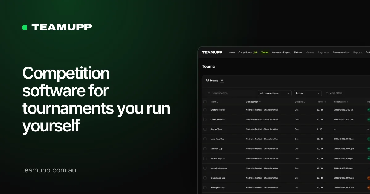
TeamUpp launched with the marketing site on teamupp.com.au and the product on app.teamupp.com.au. Every old product link, from login pages to account screens, redirects permanently to the app, so existing users never hit a dead end on launch day.
LLM SEO: getting cited by ChatGPT, Perplexity and Google AI Overviews
LLM SEO, also called answer engine optimisation, is the work of making a site easy for AI assistants to find, understand and quote. Google says AI Overviews and AI Mode have no extra technical requirements beyond normal search eligibility, and its advice is to allow crawling, link pages internally, keep important content in text and make structured data match the visible page (Google). Those foundations help every other assistant too.
Each AI company runs its own crawlers, and a site has to allow the ones behind search answers. OpenAI's OAI-SearchBot decides which sites can appear in ChatGPT search results (OpenAI). Anthropic uses Claude-SearchBot to index pages and Claude-User to fetch a page when someone asks Claude a question, and blocking either cuts a site's visibility in Claude's answers (Anthropic). TeamUpp's robots.txt names each of these crawlers, so the rules are explicit.
- Answer the question in the first sentence. Assistants quote passages that stand on their own, so every guide and section opens with the direct answer.
- Use the buyer's exact question as a heading. A heading such as "How much does a website cost in Australia?" matches how people prompt an assistant.
- Keep names and facts consistent everywhere. The product name, category and price should read the same on the site, in the schema and on profiles elsewhere.
- Publish first-hand detail. Real screenshots, real numbers and named processes give an assistant something worth citing over a generic summary.
- Submit to Bing as well as Google. Several assistants draw on Bing's index, and IndexNow tells Bing about a new page within minutes (IndexNow).
Google counts AI Overview and AI Mode traffic inside the normal Search Console performance report, so one dashboard tracks both. Our guide to answer engine optimisation goes deeper on content structure and measurement.
How long does a SaaS website take to build?
For an experienced web developer and designer, an early-stage SaaS website that's set up to perform takes about 10 to 20 hours. That covers a homepage, a product or features page, pricing, contact and a first guide or two, plus the full launch checklist above.
| What decides the time | Faster end of the range | Slower end of the range |
|---|---|---|
| Buyer and positioning | The founder already knows the buyer and their words | The positioning is still being worked out |
| Product screenshots | A demo account with realistic data already exists | Demo data has to be created and the product tidied first |
| Brand | Logo, colours and type are settled | The design system is created alongside the site |
| Pages and content | Four or five core pages | Feature pages, solution pages, free tools and guides |
| Launch | A new domain with nothing to migrate | An existing app or site that needs redirects and DNS changes |
The build hours are the visible part. The bigger cost for most founders is the weeks spent learning tools and rewriting copy while the product waits for its launch.
How much does a website cost in Australia?
Published 2026 price guides put a professionally built small business website in Australia between about A$2,000 and A$15,000, with custom web applications starting around A$30,000. SaaS websites usually land in the agency tiers, because they need product screenshots, a pricing page, structured data and a clean handover into the app.
| Who builds it | Typical upfront cost (AUD) | Source |
|---|---|---|
| DIY website builder | $200 to $500 a year | Creadiv |
| Freelancer | $1,000 to $5,000 | Creadiv, iTecHelp |
| Boutique agency, custom design | $5,000 to $15,000 | iTecHelp |
| Larger agency | $8,000 to $25,000 and up | Creadiv |
| Custom web application | $30,000 to $150,000 and up | WP Creative |
Running costs add roughly A$500 to A$2,500 a year for hosting, domains and maintenance on a typical site (Creadiv). A Next.js site on Vercel sits at the low end, because static pages cost very little to serve, and our hosting guide breaks down what each platform costs to run. The cost worth planning for is keeping the site current as the product changes, which is why we set every site up so a new page or a fresh set of screenshots takes minutes.
How we build SaaS websites for clients
We build SaaS and startup websites end to end, from the buyer research and wireframes through design, build and launch. We also set up and manage the site in Google Search Console and Bing Webmaster Tools, so indexing problems get fixed before they cost you traffic, and we keep the site moving as the product grows.
When the product itself needs building, we do that too. We built the TeamUpp software as well as its website, and the software grew to nearly 1,000 users and processed more than A$150,000 in its first month. TeamUpp runs the competitions for Just Futsal, covering more than 100 teams across its organisations, academy teams included, over several seasons a year. Our custom software and app development work covers products like this from the first version onwards.
In our first month on TeamUpp we processed more than $150,000 in registrations without chasing a single bank transfer. Parents find us on Google, pay on their phone and see their draw the same night, and I got my Sunday nights back.
Vinny Leite, Director, TeamUpp and Just Futsal
If you're launching a software product and want the website and the search setup done properly the first time, get in touch.